Hertz's New York City Subway Map
- Feb 27, 2020
- 3 min read
Updated: Feb 28, 2020
Last week, on February 18th, Michael Hertz, the man behind the design of the NYC Subway map died, aged 87. The Metropolitan Transit Authority (MTA) hired the design company Michael Hertz Associates in the late Seventies to design a new subway map to replace the notorious one designed by Massimo Vignelli.
Vignelli's map, considered to be one of the most beautifully designed transit maps in history, was largely unpopular by the public. Vignelli's map was released in 1972. He had chosen to omit almost all geographical references to the 'world above', and represent subway routes by straight lines, with the stations evenly spaced, regardless of their real distances. As a matter of fact, all these characteristics also apply to the iconic London Underground Diagram by Henry Beck, first published in 1933. However, in a city with a grid-based street plan, such a diagrammatic representation of metro routes proved to be too much for the New York public to accept. Reception by the public was quite poor. However, design and art lovers embraced the novel color scheme and the schematic representation of reality. Soon, the map was found in the MoMA.

Michael Hertz was hired by the MTA to help design a map that reintroduced geographical features (well, that is what differentiates between a diagram and a map, probably). This implied the reintroduction of curves in the subway lines, and surface details, like street names, parks etcetera. In fact, a map of New York was produced, with subway lines superimposed. But it worked, and was well received. This time not by design aficionados, but by the people who used the map to find their way in a complicated subway system.

One obvious difference is the space in the upper right corner. Vignelli has chosen to leave the space blank, which is quite unusual in transit maps. Most designer of transit maps seem to have a certain 'horror vacui'. At least the designers at Hertz's company had: the space in the upper right has been filled by one of the largest legends ever seen in a map. As can be seen, the color scheme is 'trunk based': lines that stem from the same trunk have the same colors. Details of the service of these lines, are shown in the legend, in blocks matching the colors of the respective colors.
A clever detail is the way special rush hour express services are shown: these are shown on the map as parallel lines, jumping over stations not serviced by the express trains. The 'how to use this map' section clearly explains in detail what all icons mean.

A part of Hertz's map not often discussed is the back. It shows schematic versions of all lines, as they are often shown in carriages. Here you have the straight lines, evenly spaced stops and quick to read transfer information. Just as most diagram lovers like to see them. If you compare this with the line information on Vignelli's map, which was text only in colored blocks (yes, of course in Helvetica, but that does not justify everything), this is a major improvement.
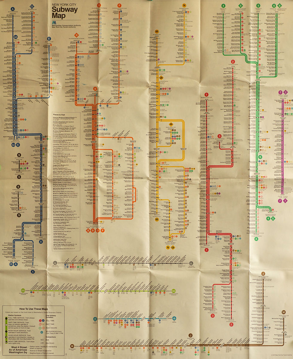
In combination with the geographical correct map on the front, I think this design has everything one looks for in an underground map. So maybe, Hertz's should be credited a bit more for the way he depicted the NYC subways. He choose to separate the map and the diagram, but to offer them both.
That is a true example of 'form follows function'.
Comments